The Oregon Area Historical Society website redesign was an enormous undertaking, and our team of 3 had to be highly communicative, efficient and agile. OAHS is a great organization with an extensive collection of photos, stories and events. The goals of this project were to simplify the user flow, update the style and organize the photos in a logical way. The people at OAHS are some of the nicest people I’ve ever met, so it was imperative that we give them something great.
Working in a team and with real clients, communication was critical to the success of this project. Part of my role was to organize our goals, solutions and expectations to present them to the client in a logical and easy-to-understand way. Starting with a 1 page creative brief and ending with an 18 page training guide, I tried to make the clients as comfortable with the process as possible.
Click on the links below for a PDF of the document
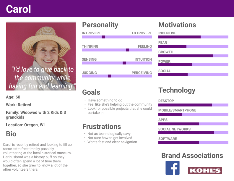
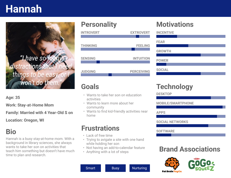
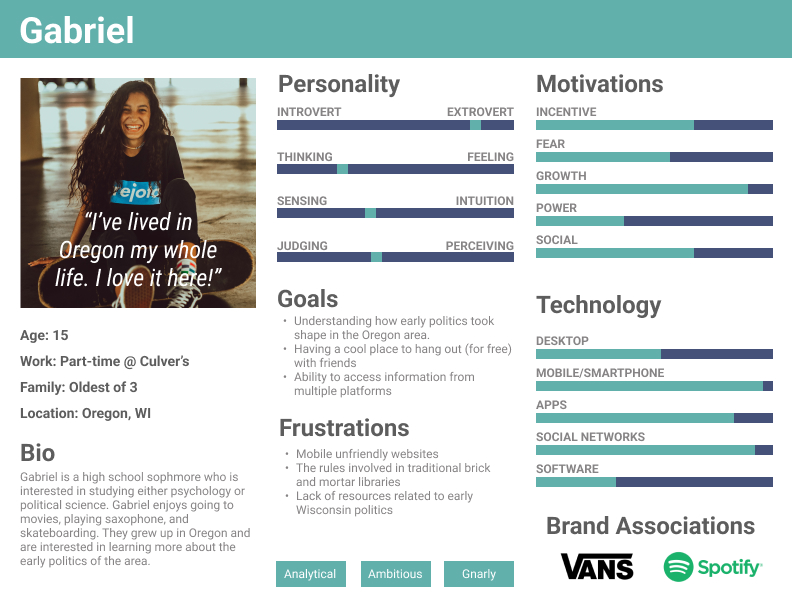
We wanted to make sure that the website was accessible for everyone, so we looked at a wide array of people. We landed on a teenager using the society as a tool for a school project, and stay-at-home parent looking for fun day activities and a senior whose simply interested in the history of Oregon.
personas
We wanted to make sure that the website was accessible for everyone, so we looked at a wide array of people. We landed on a teenager using the society as a tool for a school project, and stay-at-home parent looking for fun day activities and a senior whose simply interested in the history of Oregon.
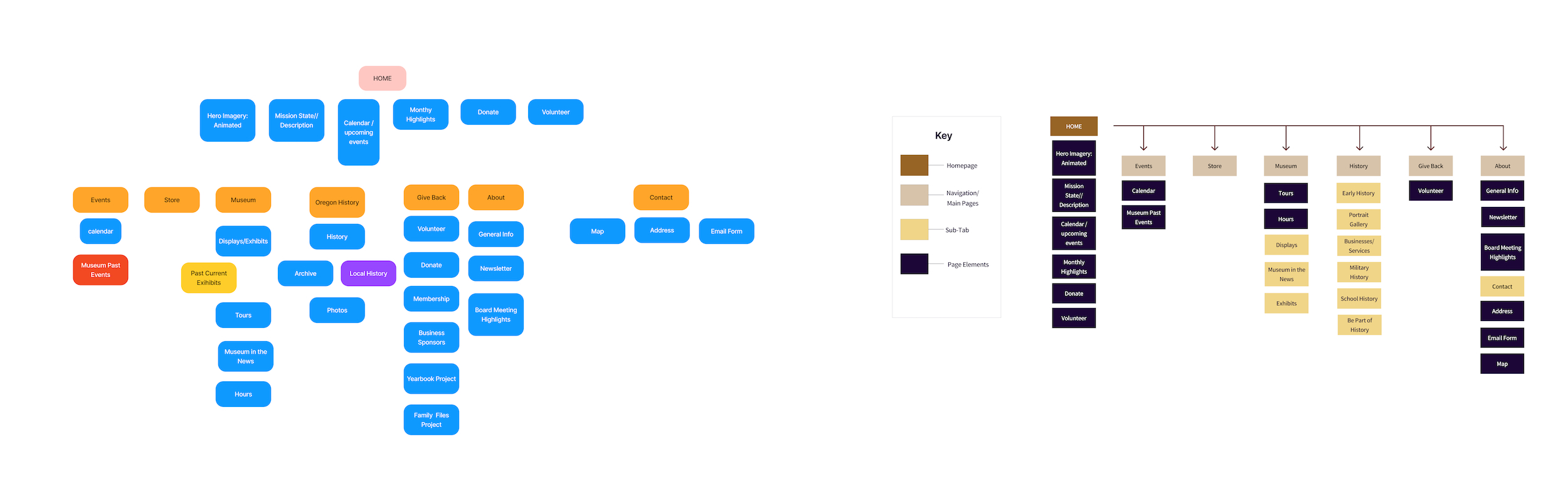
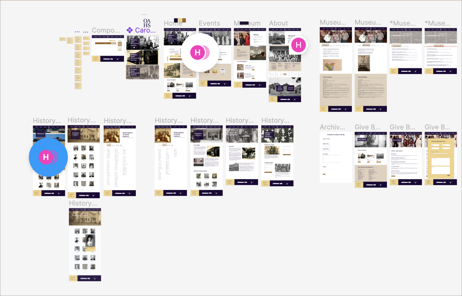
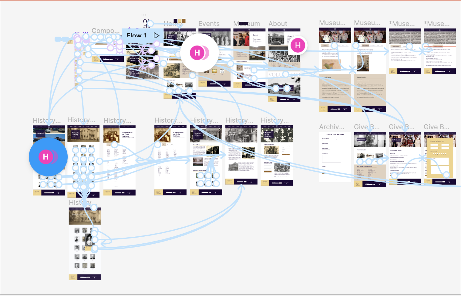
site flow
The site initially had some issues like redundancy, circular flow and confusing organization. By consolidating menu items, creating clearer paths to desired pages and making certain pages information hubs, we were able to create a site flow that works for all types of visitors.
site flow
The site initially had some issues like redundancy, circular flow and confusing organization. By consolidating menu items, creating clearer paths to desired pages and making certain pages information hubs, we were able to create a site flow that works for all types of visitors.
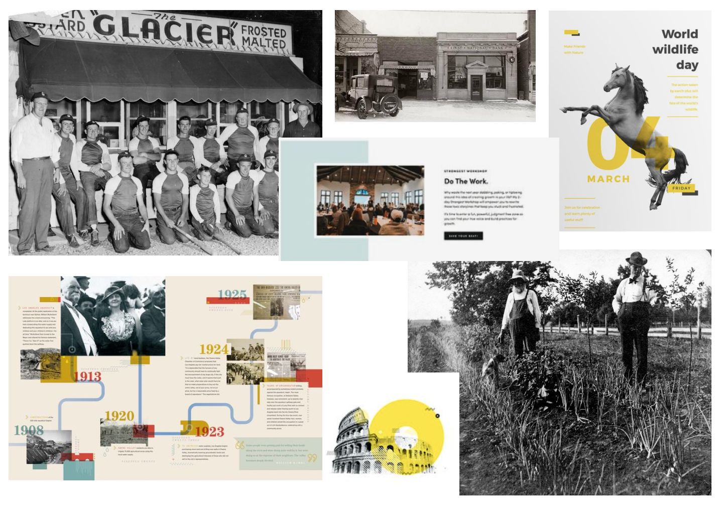
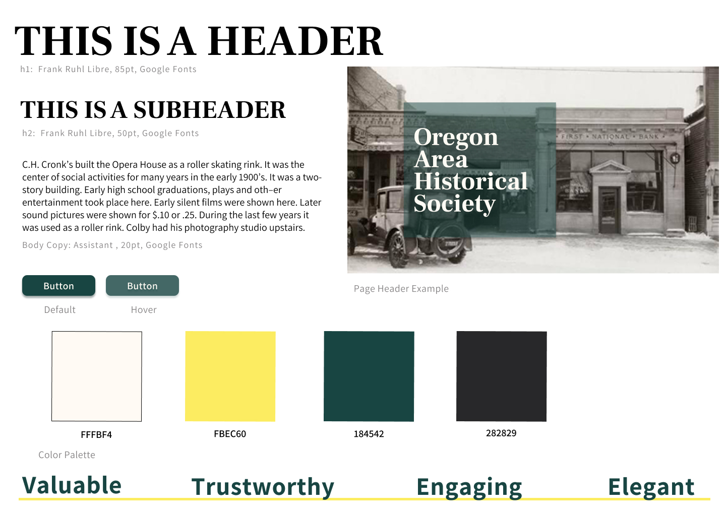
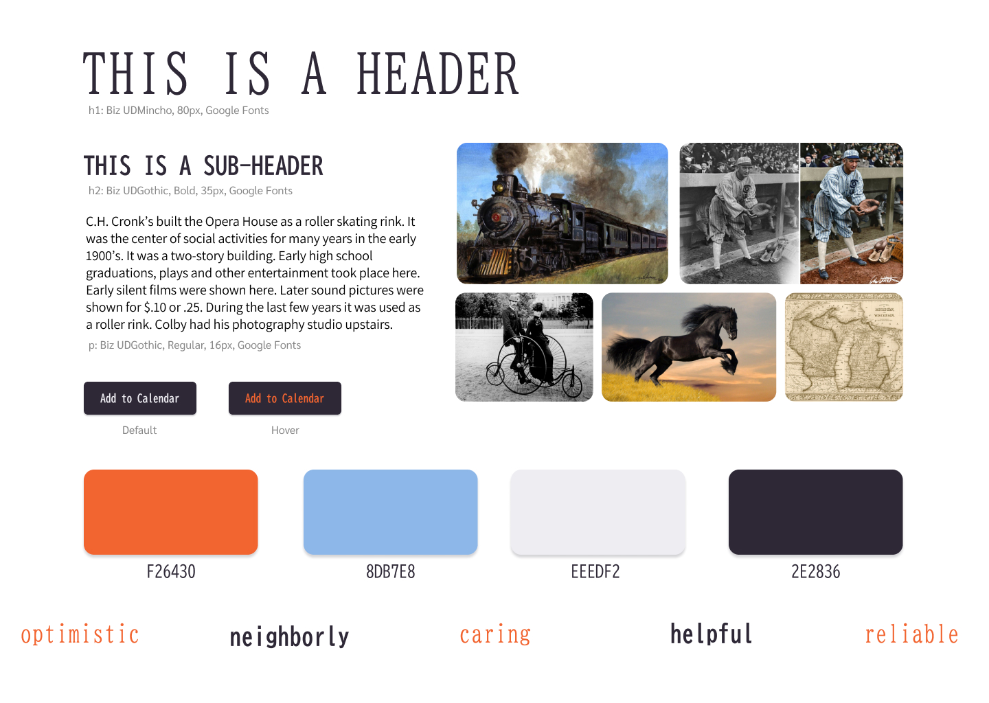
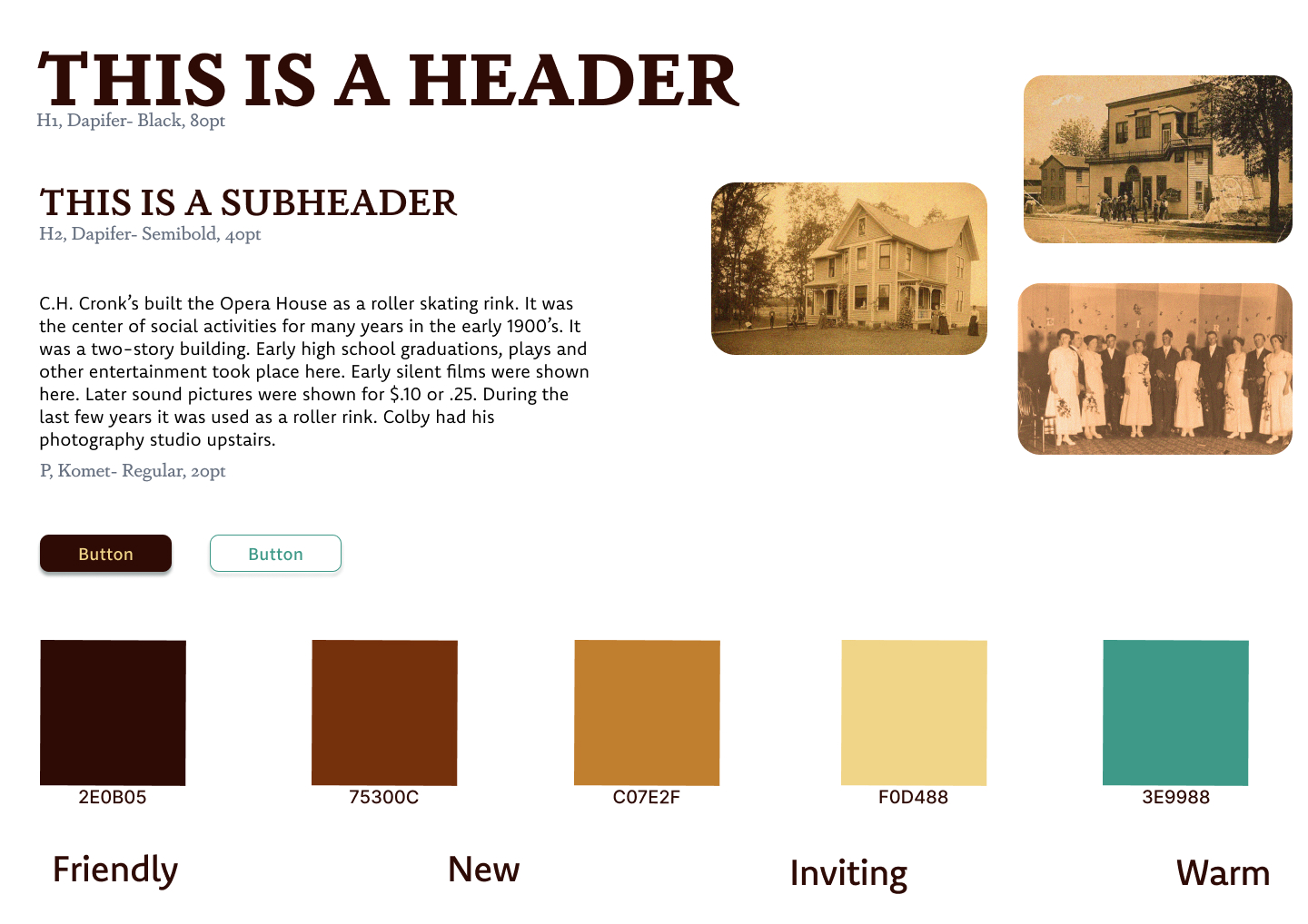
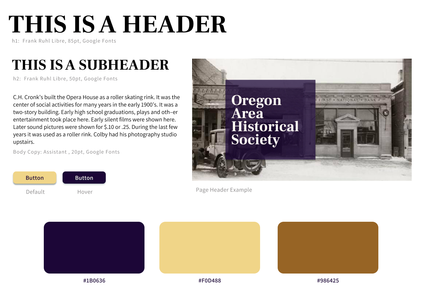
style
We developed 3 designs for OAHS to choose from – each with a different feel while working within the parameters outlined in our client brief. OAHS liked aspects of each style and wanted to meld the 3 into one. The solution is inviting, reliable and engaging.
style
We developed 3 designs for OAHS to choose from – each with a different feel while working within the parameters outlined in our client brief. OAHS liked aspects of each style and wanted to meld the 3 into one. The solution is inviting, reliable and engaging.
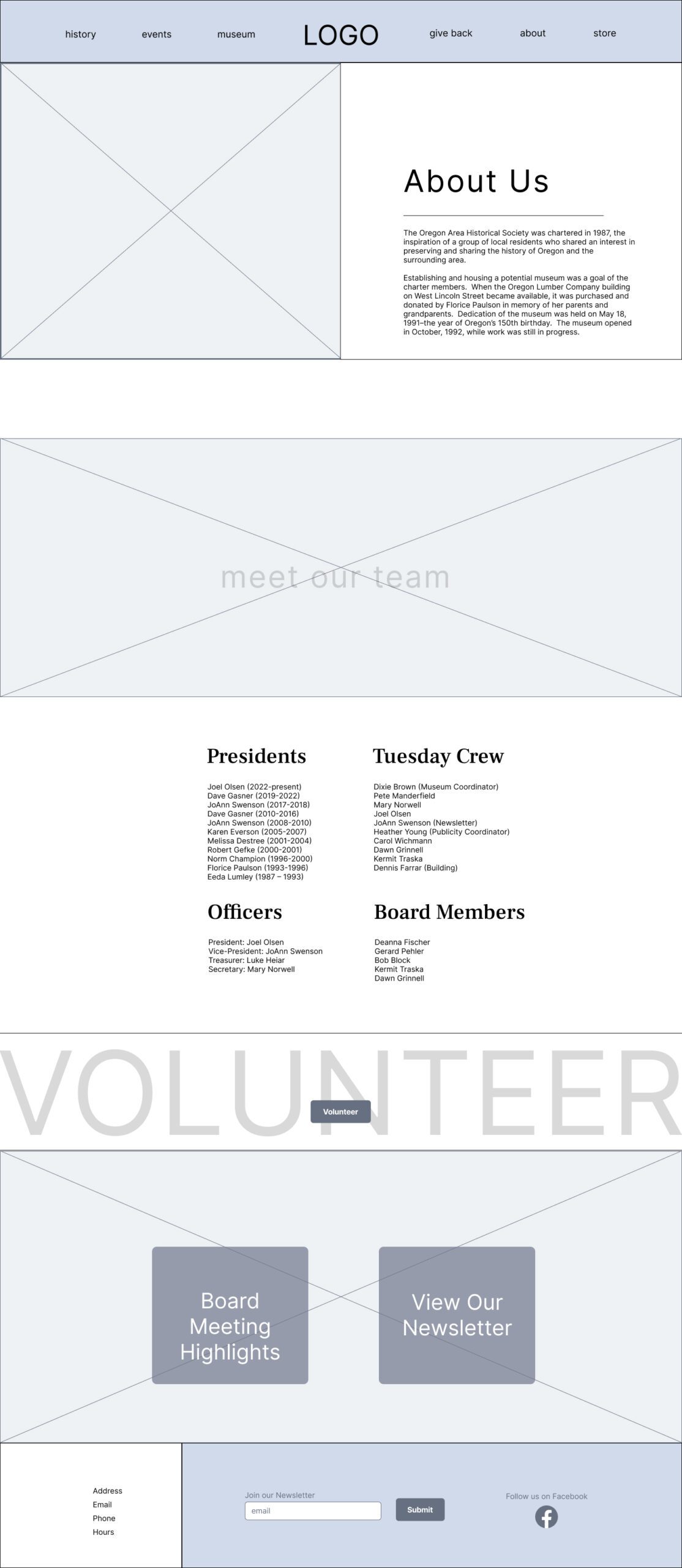
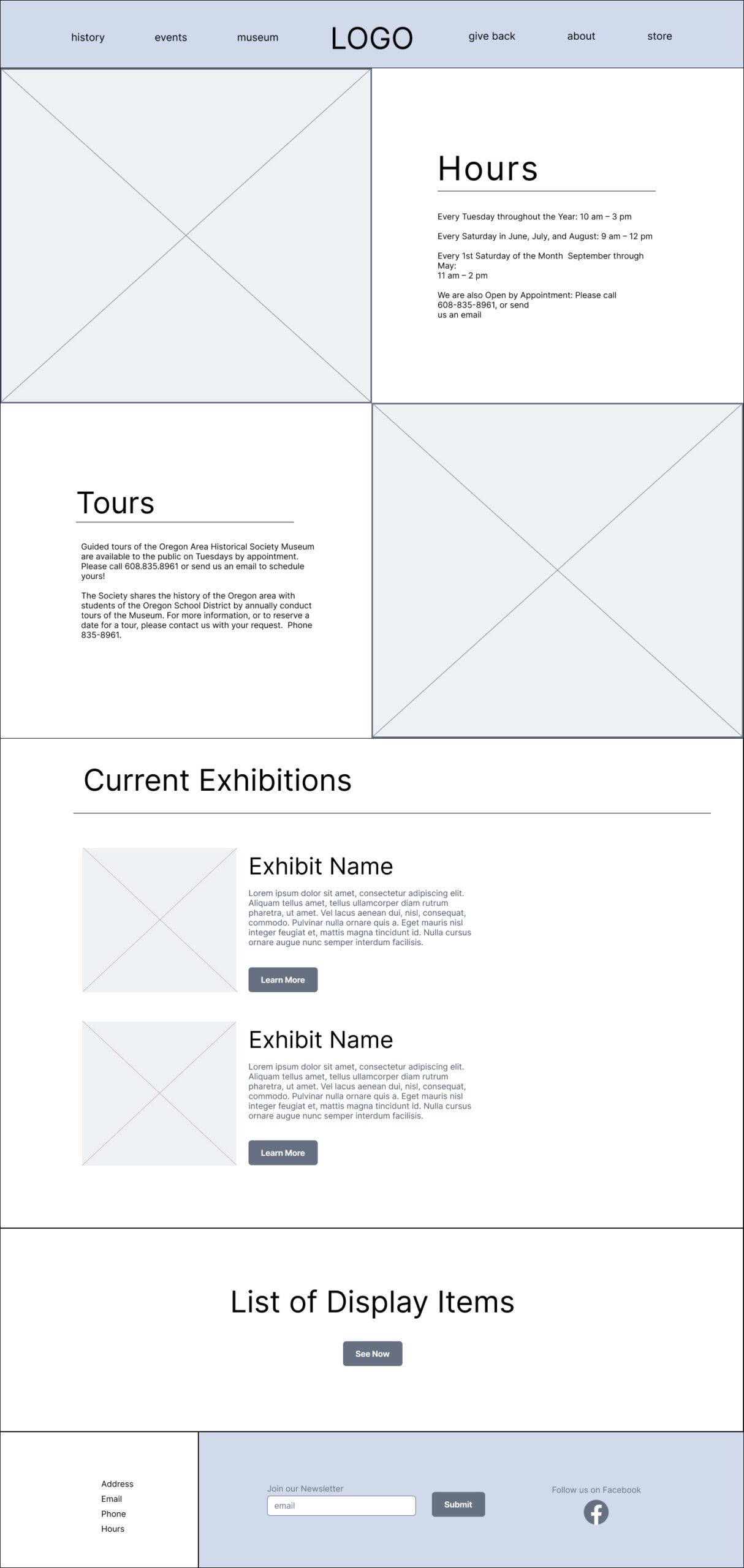
wireframes
We wanted users to be able to locate their desired information quickly and easily. To do that we tried to funnel users into larger sections where a lot of information was being displayed as opposed to having more pages with specialized objectives.
wireframes
We wanted users to be able to locate their desired information quickly and easily. To do that we tried to funnel users into larger sections where a lot of information was being displayed as opposed to having more pages with specialized objectives.
pages & prototype
Using Figma made it really easy to communicate with the client. They were able to look at our designs and give feedback, provide links to preferred images to use and walk through the user flow via prototyping.
pages & prototype
Using Figma made it really easy to communicate with the client. They were able to look at our designs and give feedback, provide links to preferred images to use and walk through the user flow via prototyping.
screens
We knew that people were going to be using the site in a number of different ways, so it was important to make sure that the site was as responsive as possible. We kept accessibility and responsiveness top-of-mind throughout the project and the end product is a site that can be used by anyone on any device.