James has been one of my best friends for over 15 years. When he made the decision to quit his day job and go all-in on his passion of performing magic, I couldn’t have been happier. I wanted to give James something that he could not only use during his shows, but also give as souvenirs and sell through his website. This project was a TON of fun and I’m incredibly grateful to know such a wonderful human.
James has been one of my best friends for over 15 years. When he made the decision to quit his day job and go all-in on his passion of performing magic, I couldn’t have been happier. I wanted to give James something that he could not only use during his shows, but also give as souvenirs and sell through his website. This project was a TON of fun and I’m incredibly grateful to know such a wonderful human.
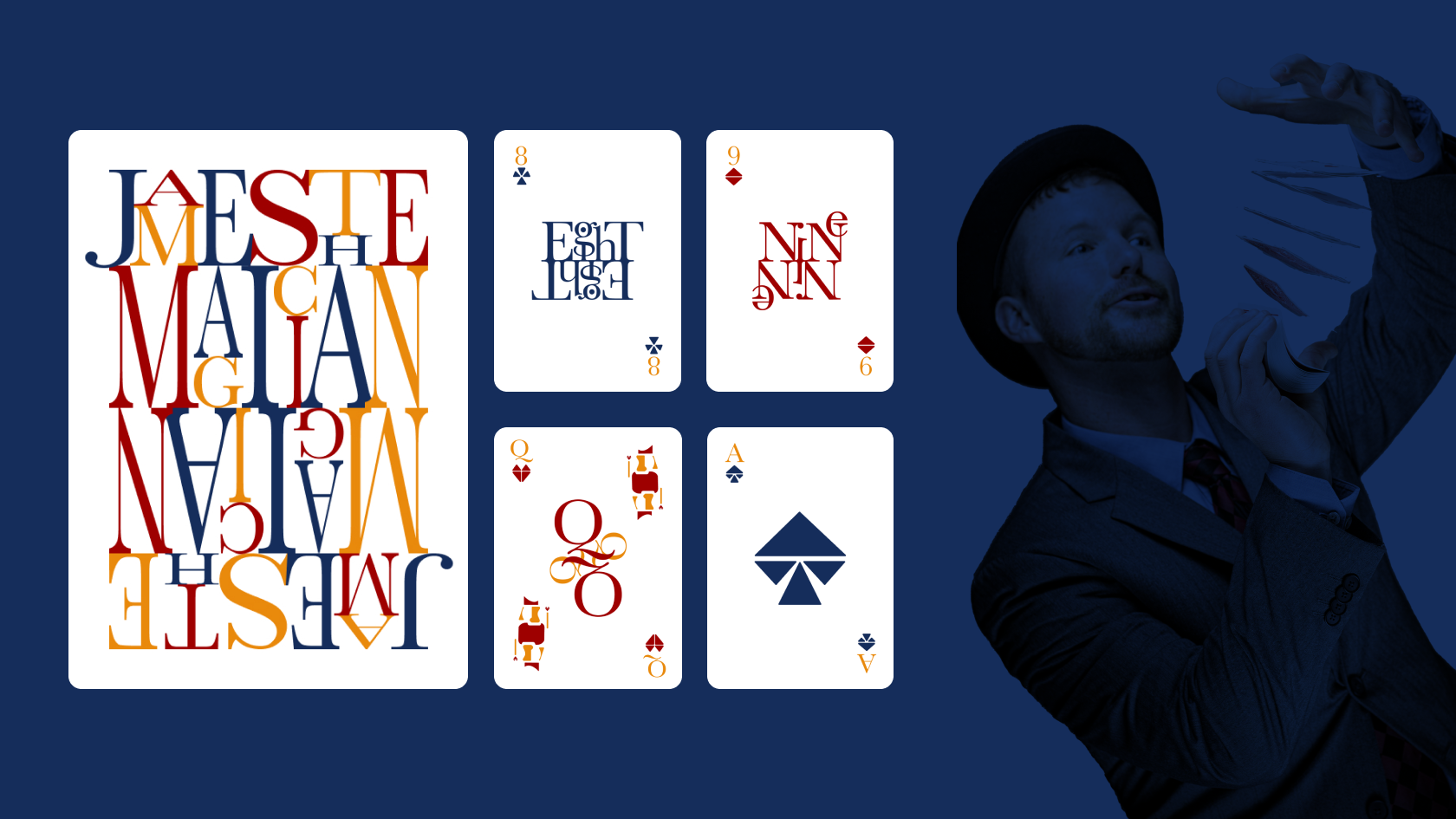
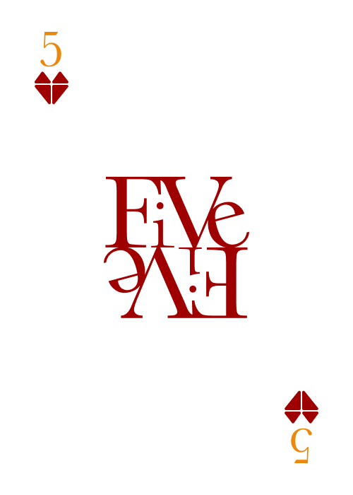
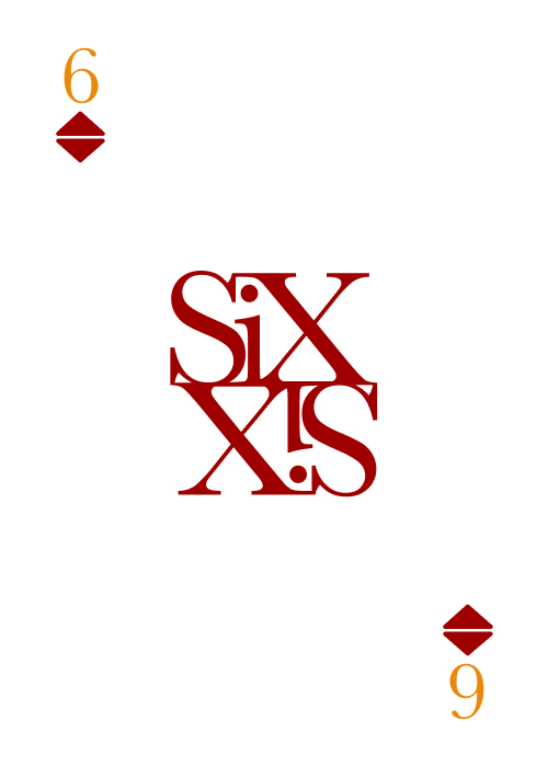
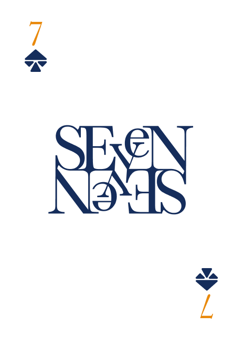
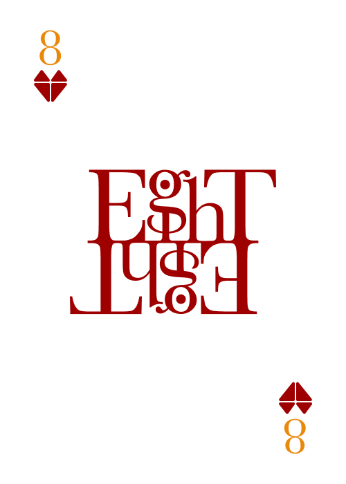
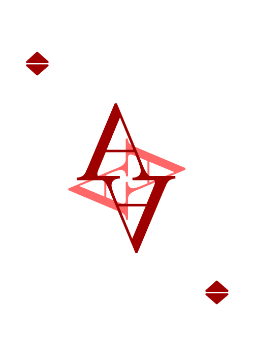
card design
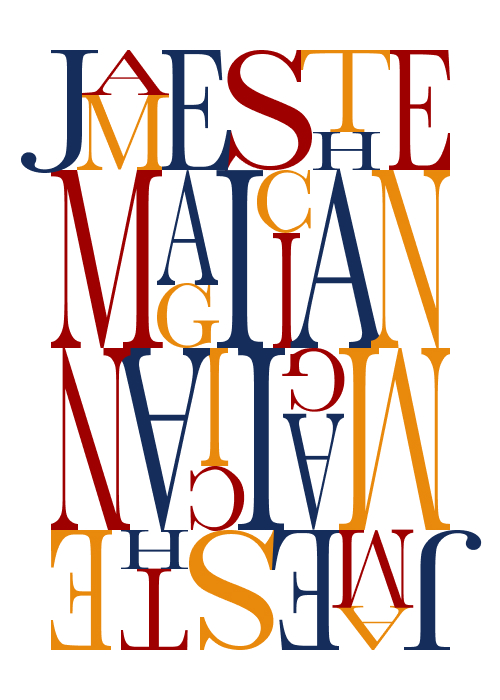
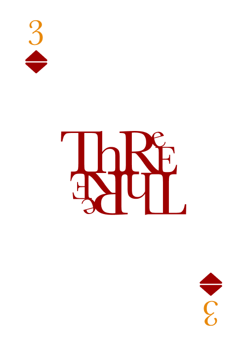
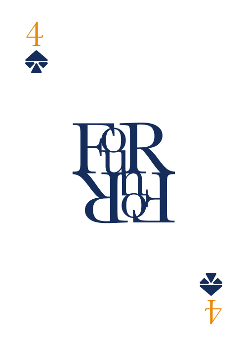
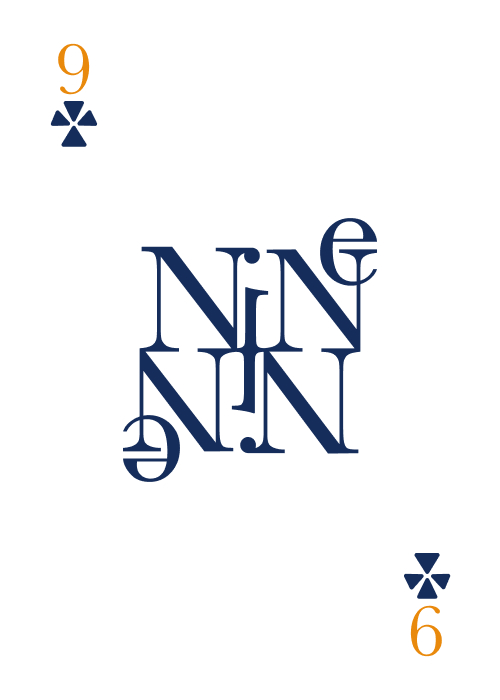
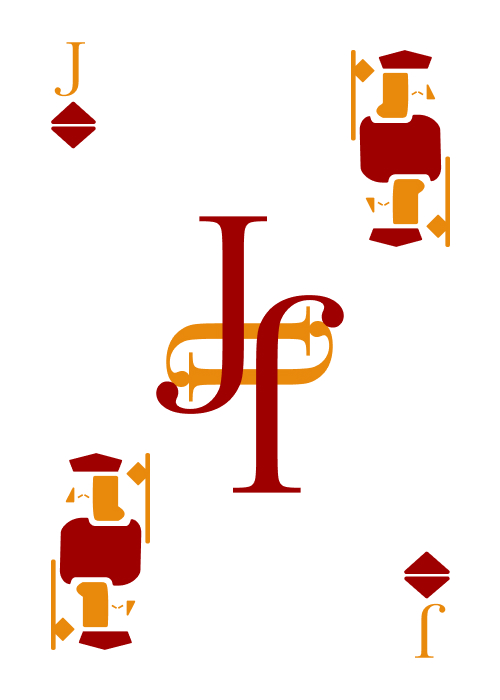
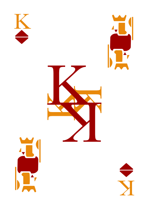
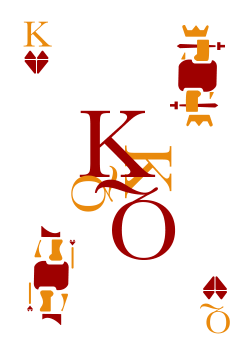
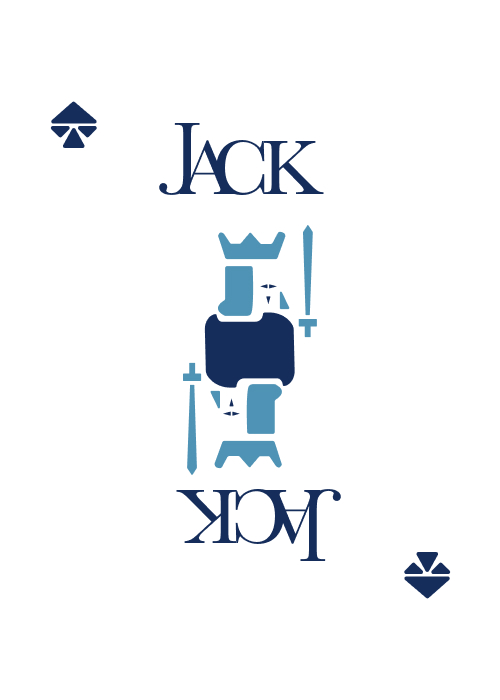
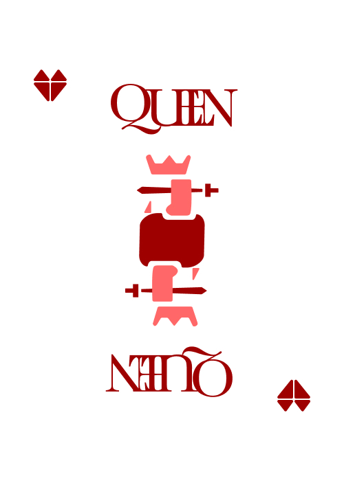
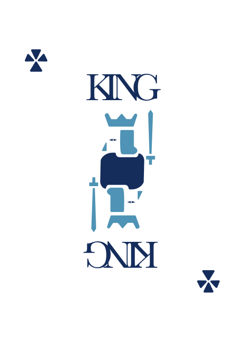
The main challenge with this project was creating something that didn’t just look cool and put a highlight on typography (Baskerville), but to create something that would be functional for James night after night on stage. Together, James and I developed this design to be both unique and multi-purpose. If you look closely, there are several easter eggs that allow James to perform unique tricks that couldn’t be performed with a standard deck of cards.
The main challenge with this project was creating something that didn’t just look cool and put a highlight on typography (Baskerville), but to create something that would be functional for James night after night on stage. Together, James and I developed this design to be both unique and multi-purpose. If you look closely, there are several easter eggs that allow James to perform unique tricks that couldn’t be performed with a standard deck of cards.
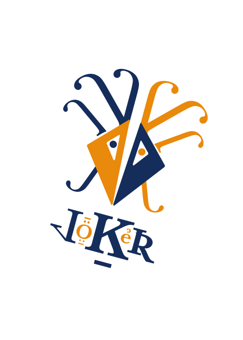
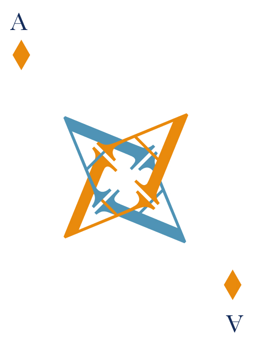
jokers
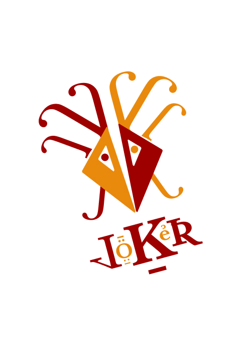
The jokers were particularly interesting to design. I took inspiration from an old logo that James had used many years ago. Keeping true to the typography theme, I used lower-cased js to create the dreadlocks, used the glyphs from Baskerville, and utilized the geometric design of the pips (suits) to create the face.
The jokers were particularly interesting to design. I took inspiration from an old logo that James had used many years ago. Keeping true to the typography theme, I used lower-cased js to create the dreadlocks, used the glyphs from Baskerville, and utilized the geometric design of the pips (suits) to create the face.
process
This project went through many iterations. Not only was I incredibly excited to do something for my good friend, but I wanted to make sure that these would work in a real-world environment. James is color blind, so making sure there was enough contrast in the colors was essential. We tried several color combinations and what we landed is both unique and easily recognizable.
This project went through many iterations. Not only was I incredibly excited to do something for my good friend, but I wanted to make sure that these would work in a real-world environment. James is color blind, so making sure there was enough contrast in the colors was essential. We tried several color combinations and what we landed is both unique and easily recognizable.
Version 1: This was too busy. There wasn’t enough contrast and it was difficult to distinguish between the cards quickly.
Version 2: The contrast was better, but it was still too difficult to distinguish between the cards.
Version 3: This was more readable, and the configuration of the letters was interesting, but it lacked functionality.
Version 4: This had good contrast and a pleasing aesthetic, but was too far from a standard playing card to work for a magician.