Dinner Bell is designed for anyone who wants to practice better eating habits. The idea came from my own inability to remember to eat while working long hours. There were many days where it would become the afternoon without having breakfast, the evening without having lunch… Dinner Bell is an app that allows users to order groceries online, find recipes based on the food they have and, most importantly, remind them to EAT!
Skills: Concepting, Illustrator, Figma, XD
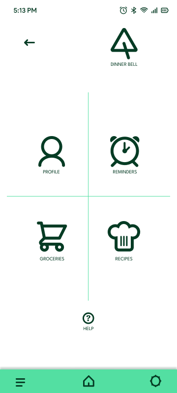
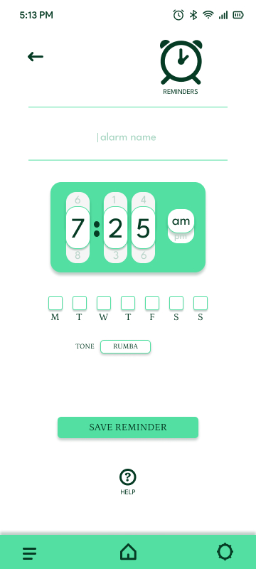
Dinner Bell is an app that allows the user to set reminders, order groceries and discover recipes. This was an extensive project that took a number of turns. Ultimately I decided to keep it simple. This app is all about efficiency, so it felt appropriate to cut out the frills and give the users something that’s intuitive, comfortable and useful.
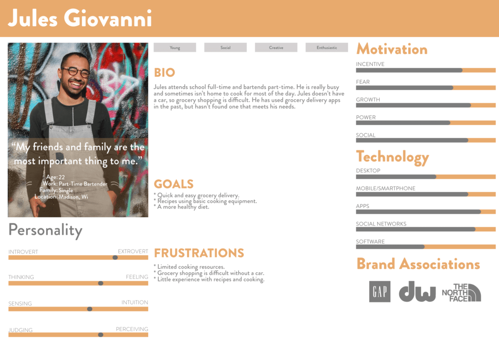
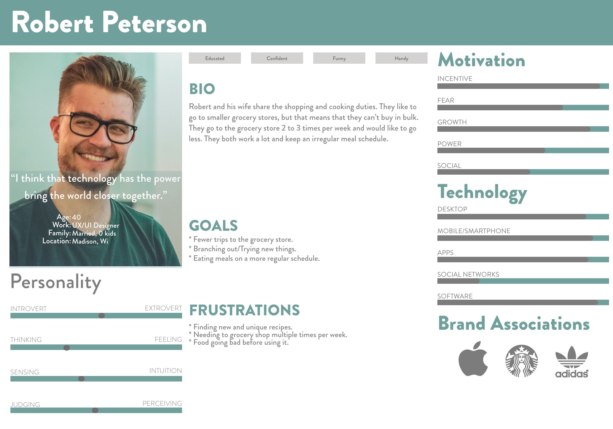
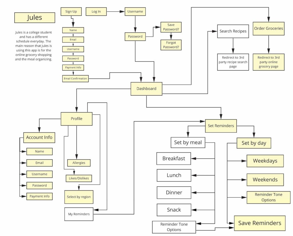
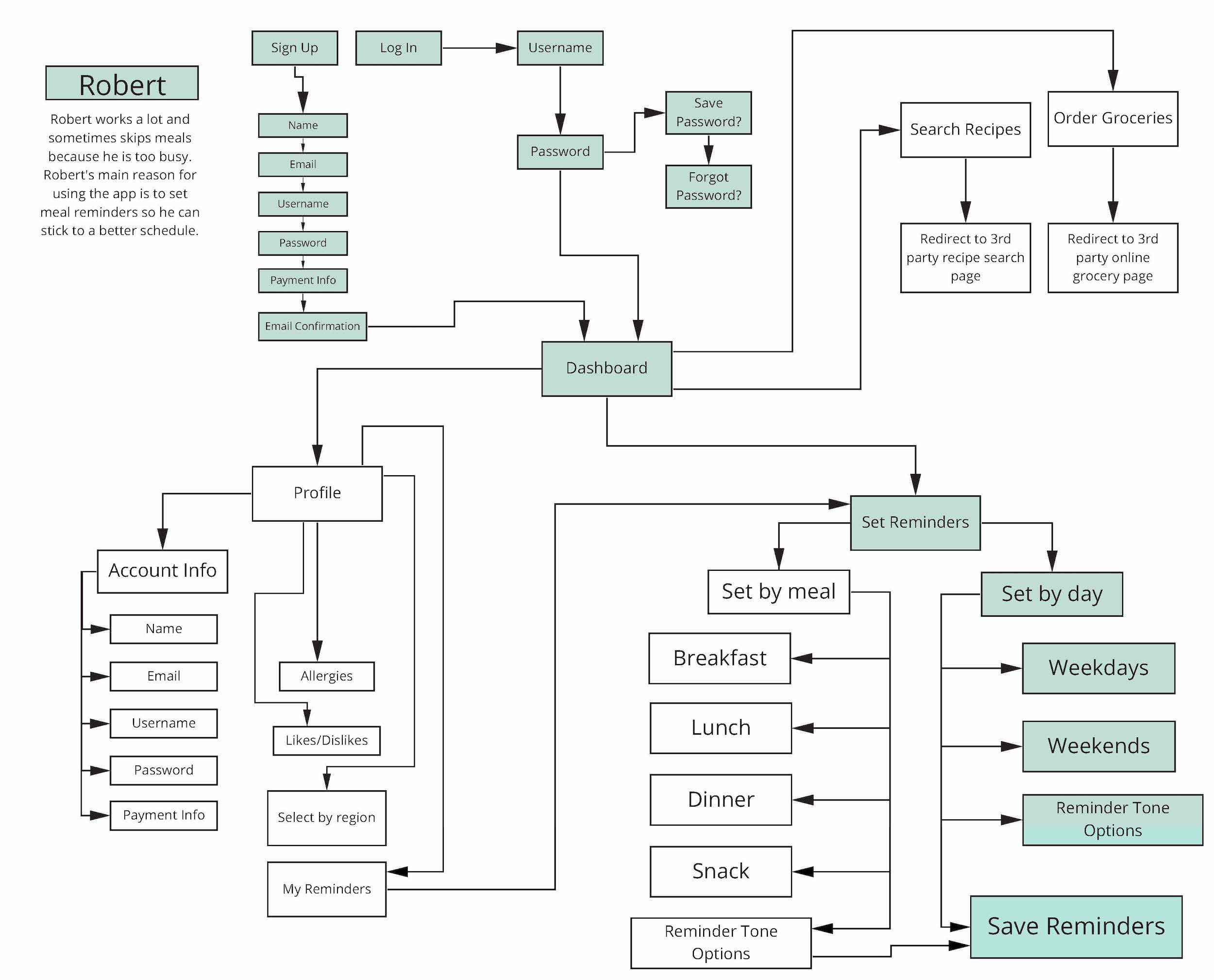
Dinner Bell is meant to be utilized in several different ways by many different types of people. On the surface, it’s a reminder to eat for people who regularly forget, but at its core, it’s a vehicle for a more healthy way of living. The user can choose their own level of involvement and can customize their program.
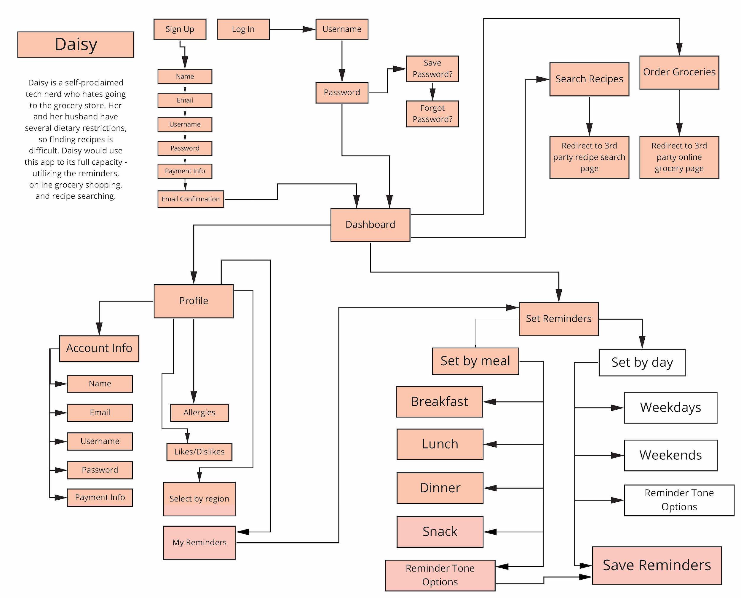
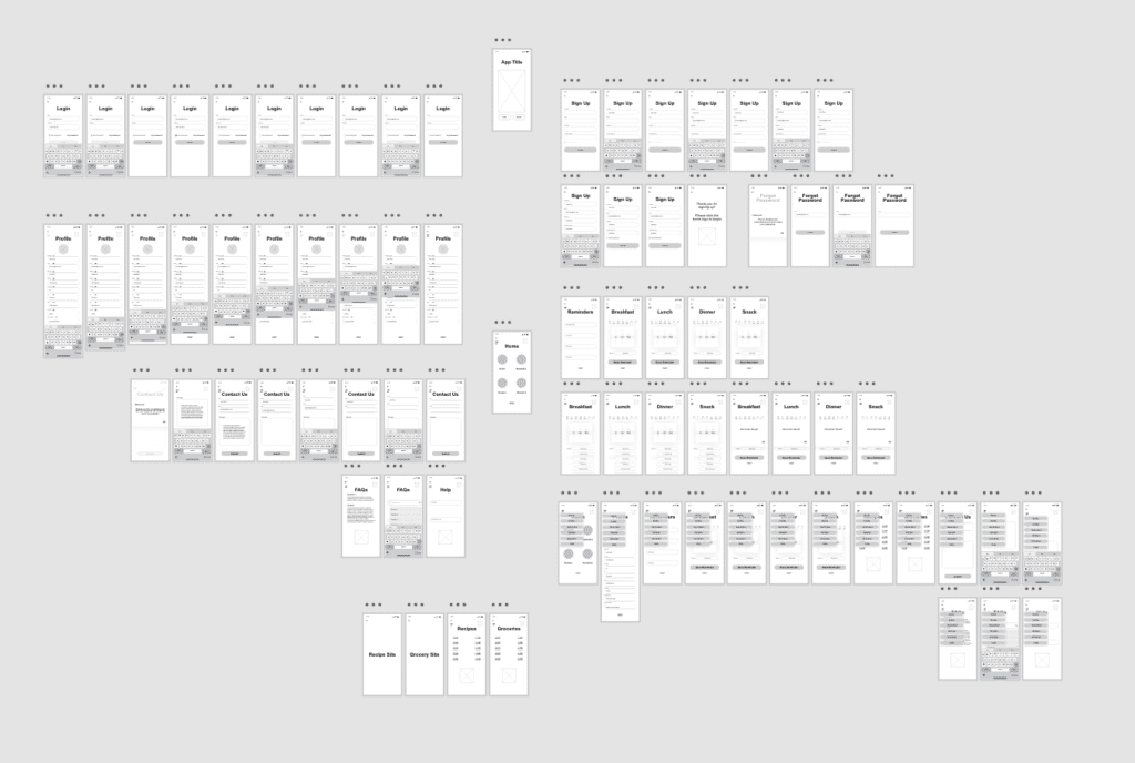
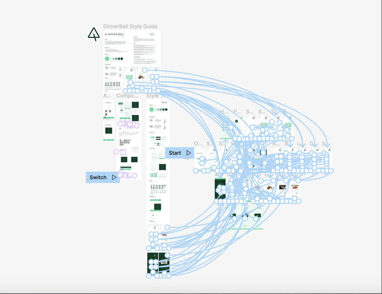
wireframes & prototype
ROUND ONE was done in Adobe XD and was a great learning experience. While I had a decent understanding of prototyping, and my prototype was functional, it was a bit clunky.
ROUND TWO was done 6 months later in Figma. I was able to simplify my design, utilize components, and develop a more modern style. Although there are considerably more pages and interactions in round 1, round 2 is more efficient and more user-friendly.
personas
Dinner Bell is meant to be utilized in several different ways by many different types of people. On the surface, it’s a reminder to eat for people who regularly forget, but at its core, it’s a call for a more healthy way of living. The user can choose their own level of involvement.
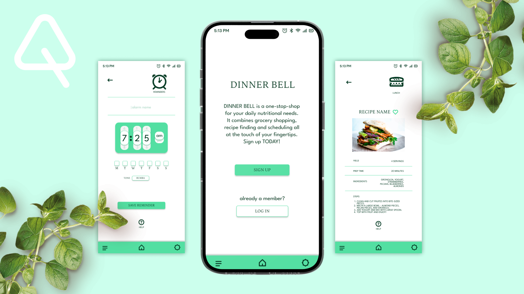
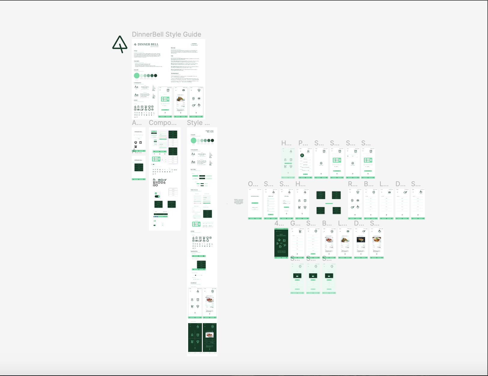
screens
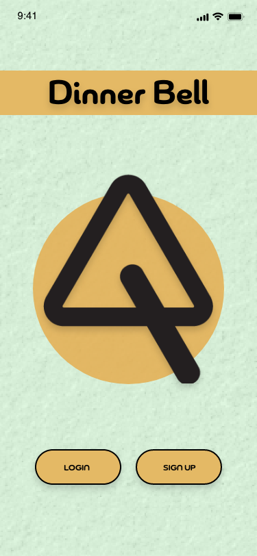
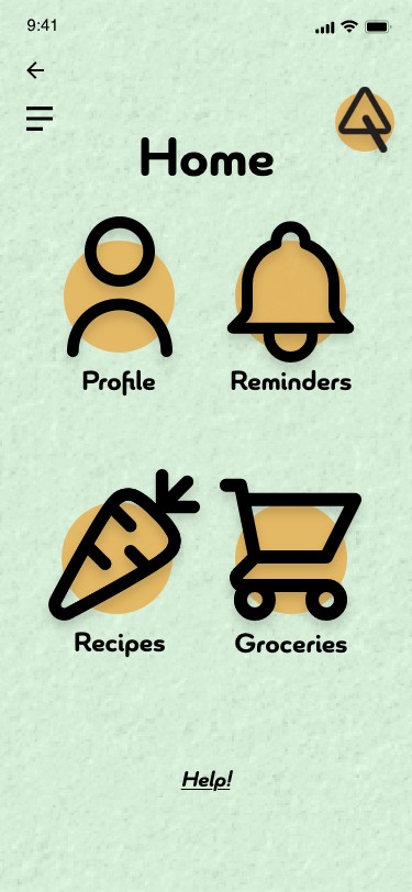
ROUND ONE was meant to feel organic, friendly and approachable. The soft texture in the background made the wide-stroked icons pop. This design ultimately felt a touch cartoonish and didn’t live up to the utilitarian nature of the concept.
ROUND TWO is cleaner and more direct. I decided to use a monochromatic palette with thick-lined icons, a large amount of white space and a more agreeable font pairing (Petrona & League Spartan).
screens
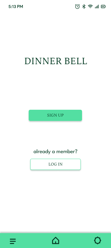
ROUND ONE was meant to feel organic, friendly and approachable. The soft texture in the background made the wide-stroked icons pop. This design ultimately felt a touch cartoonish and didn’t live up to the utilitarian nature of the concept.
ROUND TWO is cleaner and more direct. I decided to use a monochromatic palette with thick-lined icons, a large amount of white space and a more agreeable font pairing (Petrona & League Spartan).